Riot introduces UX/UI visual changes in VALORANT

VALORANT developers, Riot Games, shared with players information about the upcoming UX/UI visual changes that will come to the game with patch 5.08.
These updates are focused on the out of game experience (outside of gameplay) and will bring a fresh sense of style while improving functionality in some areas. The change means some previous functionality may be missing, but we’re still looking at your feedback as we roll out this update. Let’s break down why we’re working hard on a revamp, as well as our process and thinking around these updates.
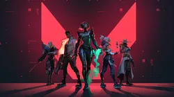
The first update, which Riot presented, related to the MVP screen.
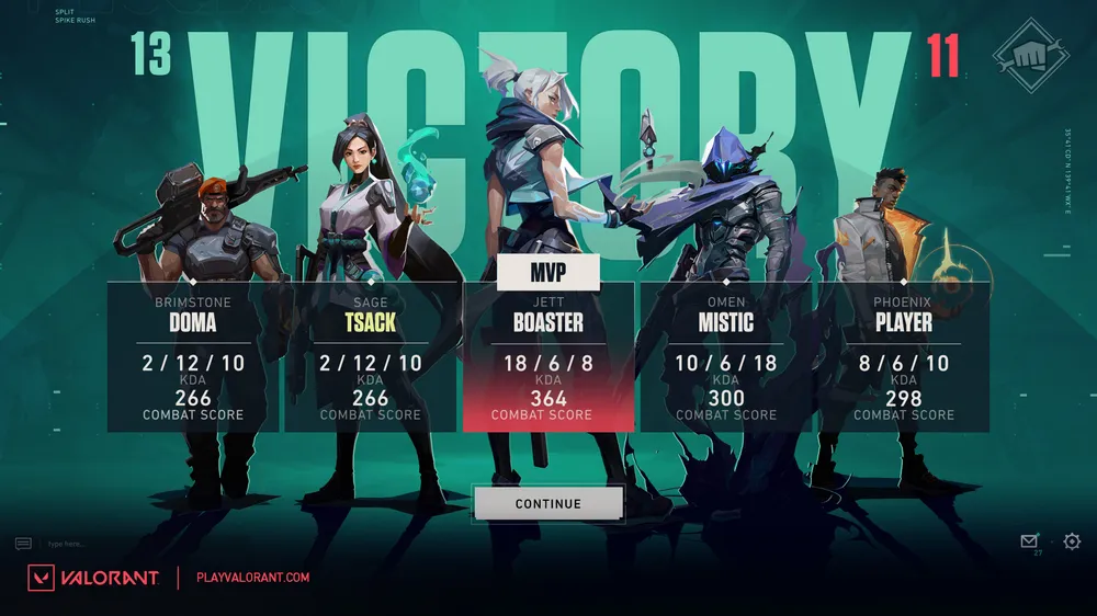
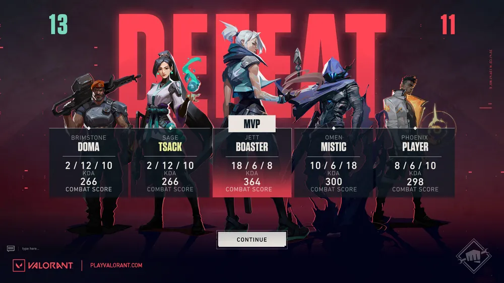
"We want you to understand the importance of the team aspect of VALORANT. This new, bold team shot helps to show off your team's MVP and your team composition while reinforcing the emotional narrative coming out of your most recent game—win or lose. We also hope this helps you appreciate the beauty of our Agent visuals with a focus on continuity into the end of game screens." — Tea Chang, UX Design Manager
Riot Games also will update a new lobby, pre-match loading screen, and End of Game screens with designs meant to improve legibility.
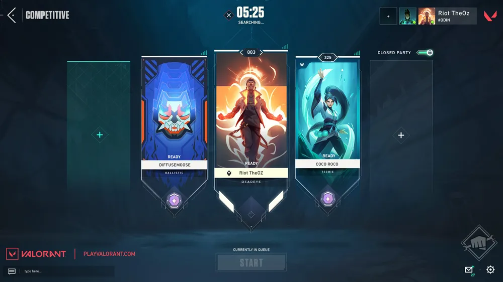
"We wanted to remove a lot of visual clutter and improve the overall readability of the Lobby Screen. We had a lot of decoration elements that were pretty but didn't really serve a purpose. In order to emphasize the Playercard and its representation. And to give you a clear ‘call to action,’ we increased the screen’s contrast, pushed color values, and simplified our shape language". — Oliver Zumstein, Visual Design Manager.
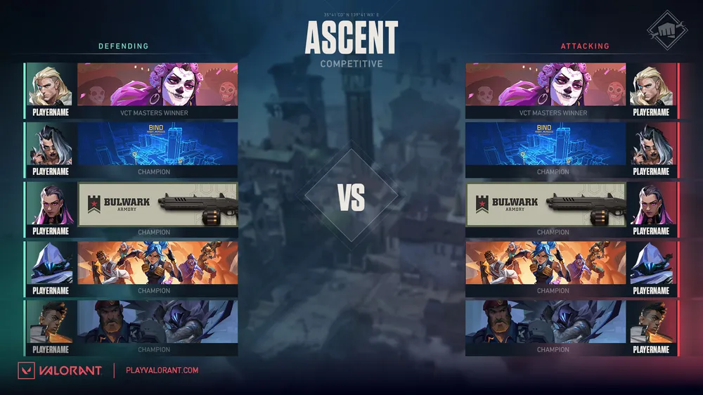
“We want the faceoff screen to be all about the two teams about to duke it out. We removed the map so your banners could take up the screen, better showing off your identity through your chosen Player Cards, Titles and Rank badges. We punched up both side's colors, mirrored banner layouts for symmetry, and added ‘VS’ text to emphasize the head-to-head feeling.” — Max Smiley, Staff Engineer.